Act 10 has 35 changes total! Check out what changed in this episode! Also, we’re back to 720p, but the images are jpg, instead of png, which is much quicker to load!
PC Users:
Mouse over = BD Version
Away from image = ONA Version
Smartphone/tablet users:
Untap/tap away from image = ONA Version
Tap image = BD Version
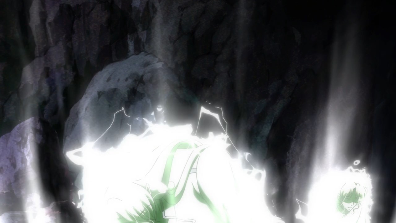
They made Queen Serenity more transparent, and made her more of a hologram, in these next three pics


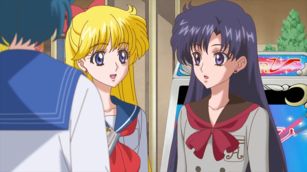
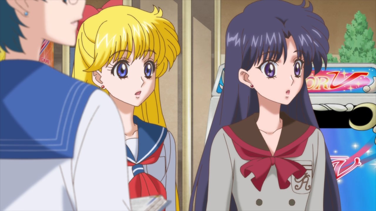
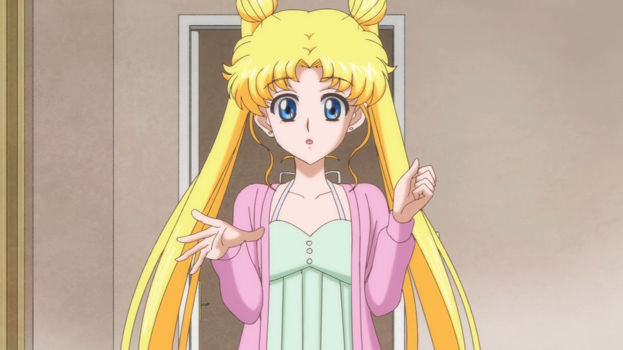


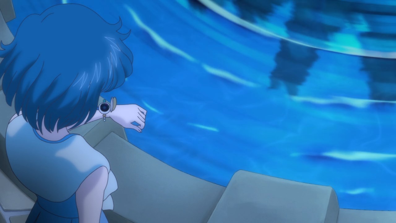
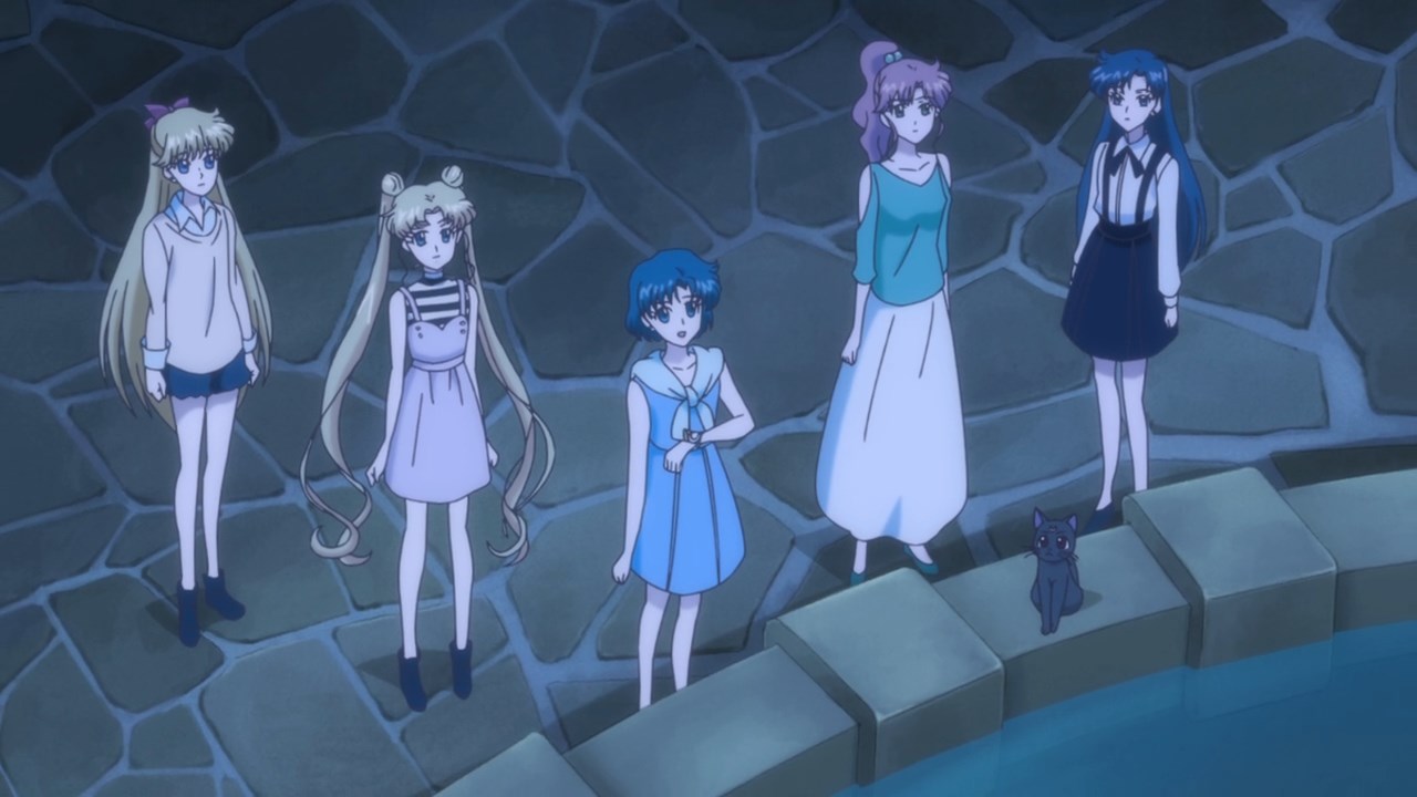
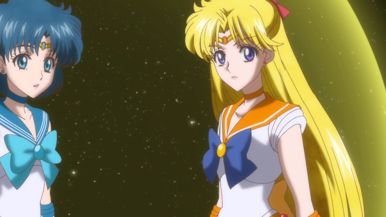
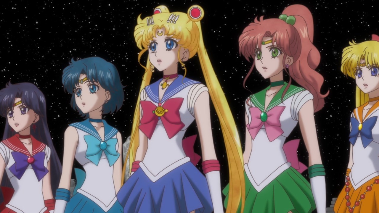
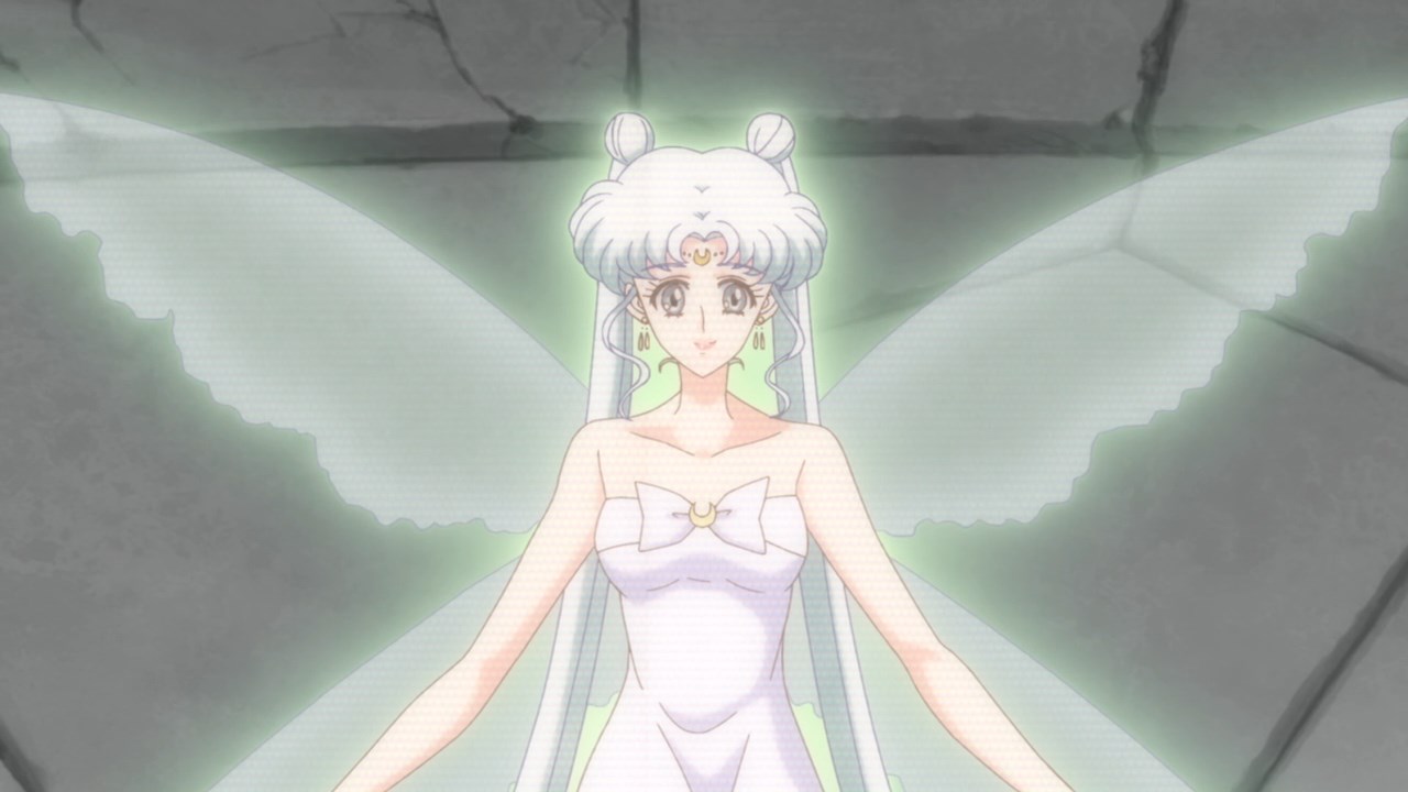
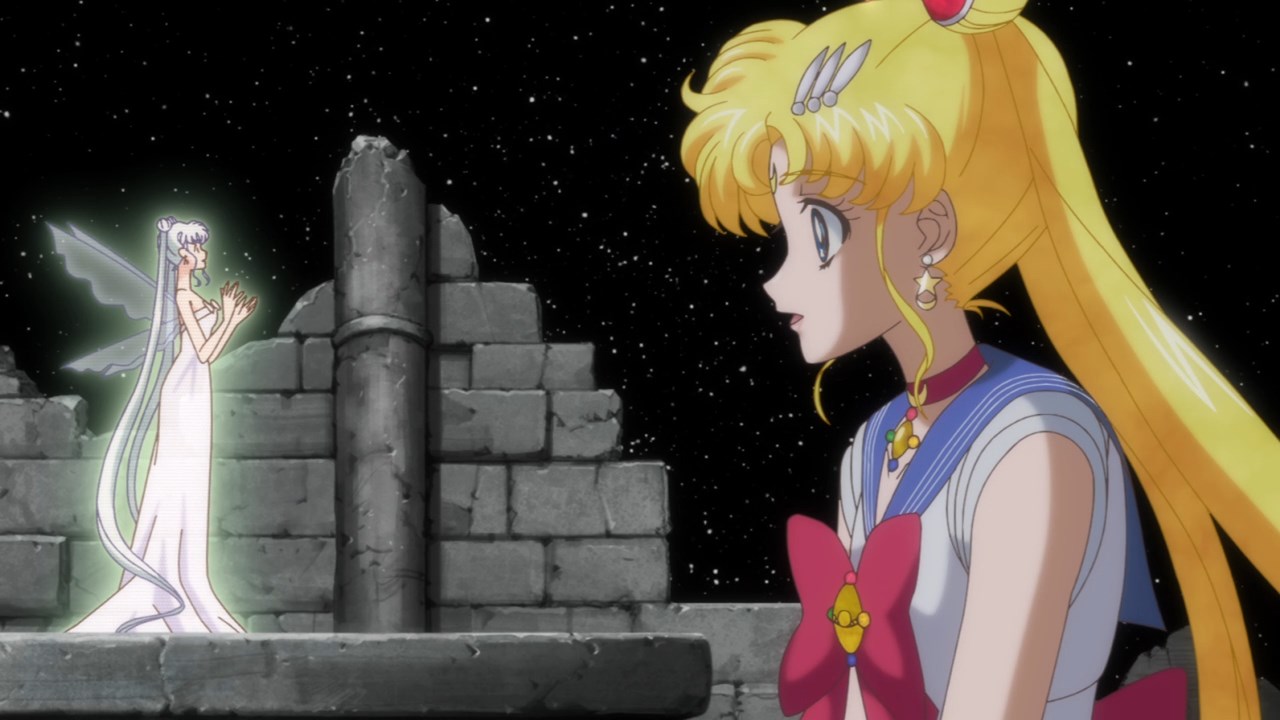
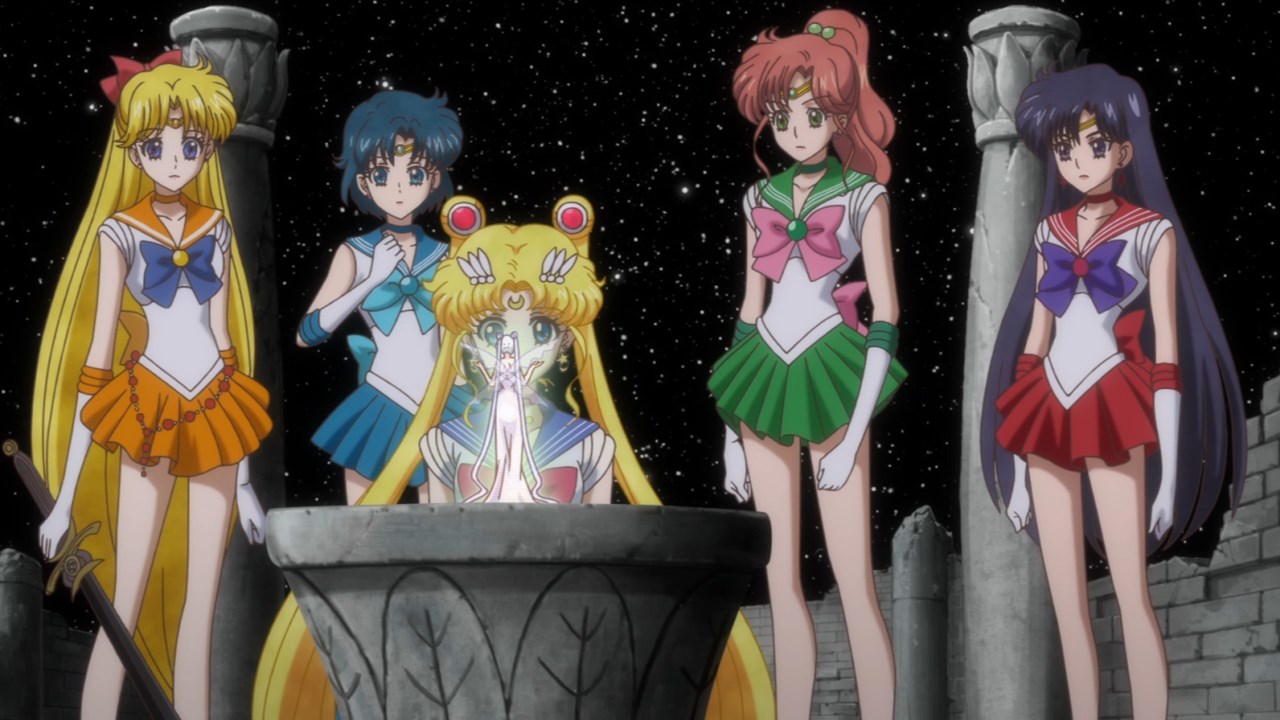
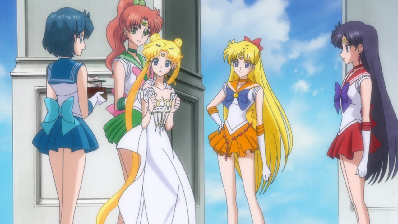
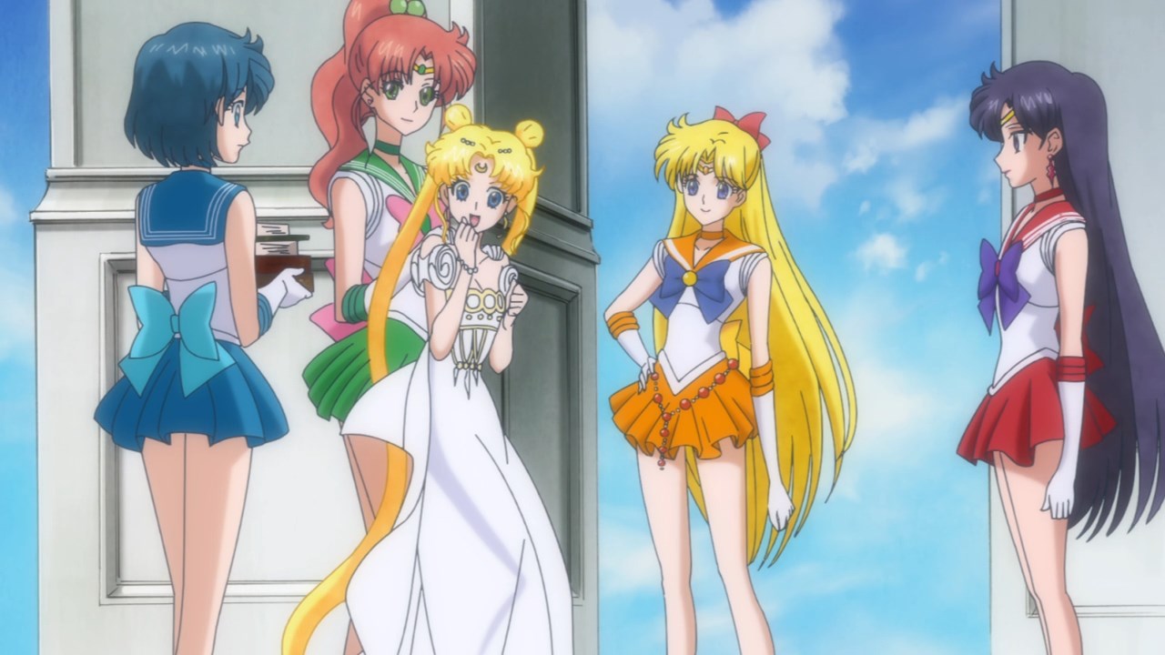
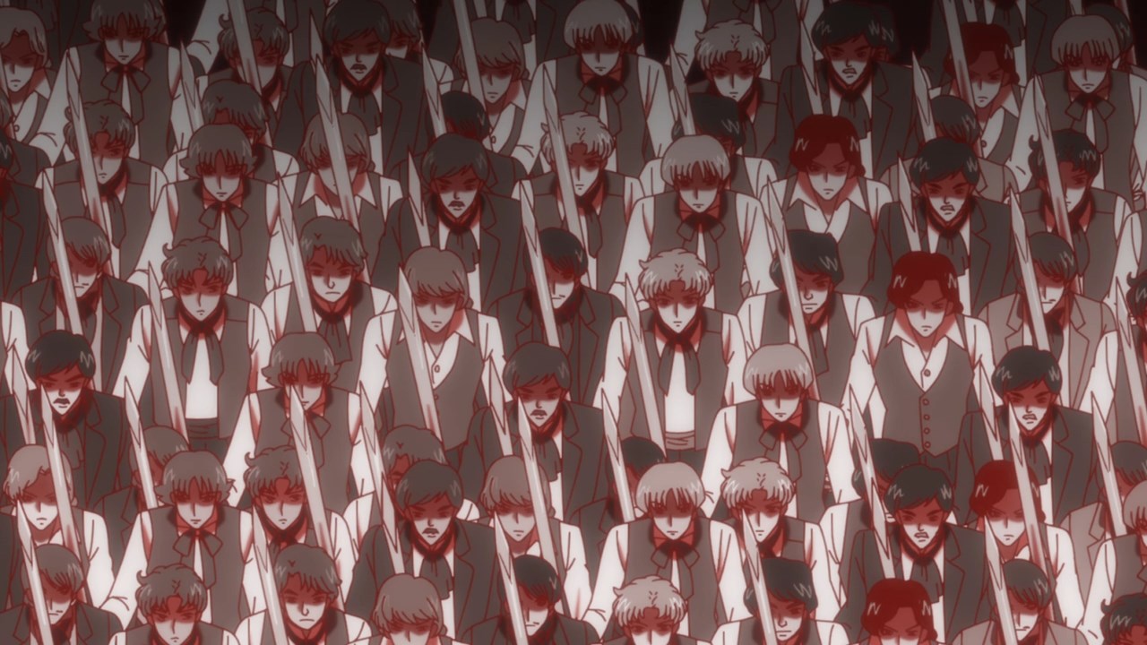
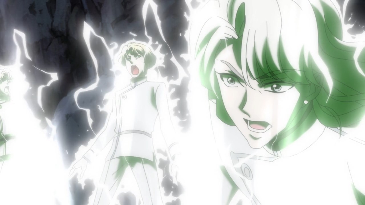
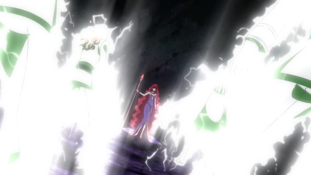
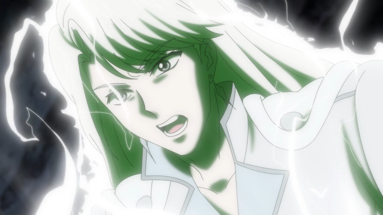
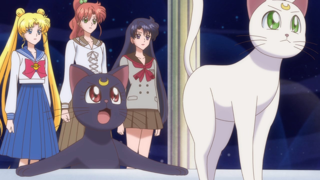
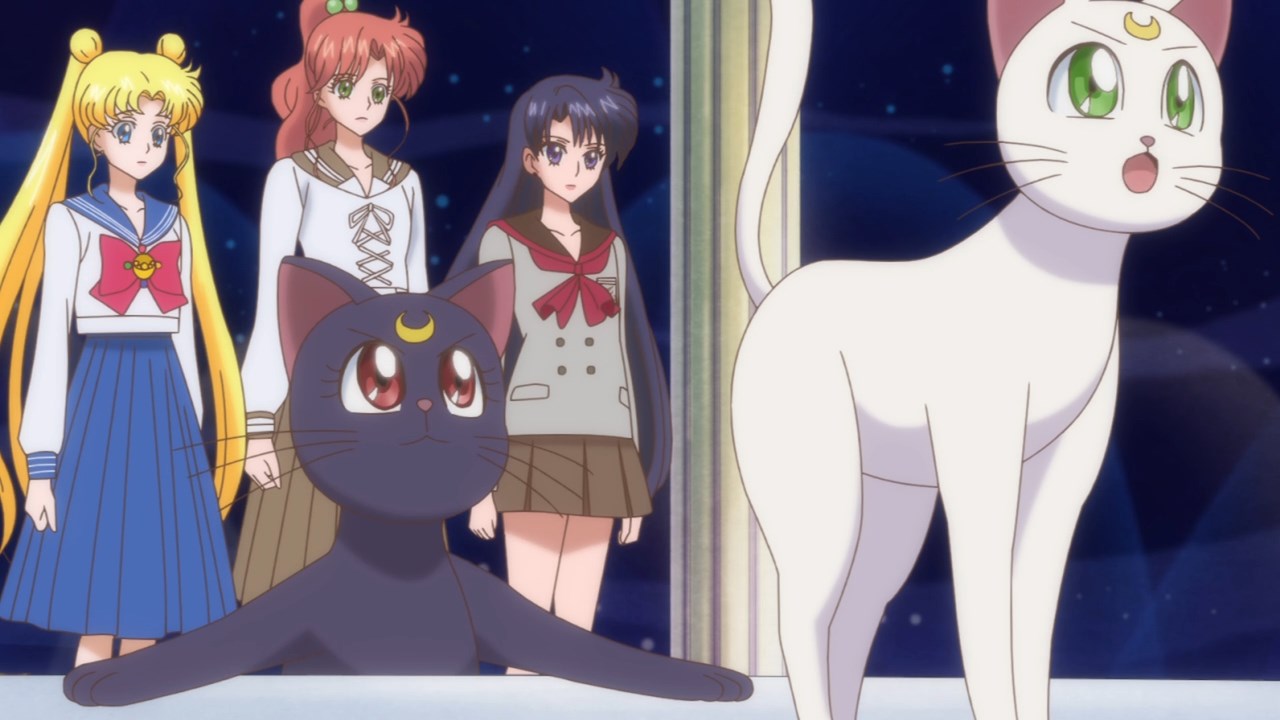
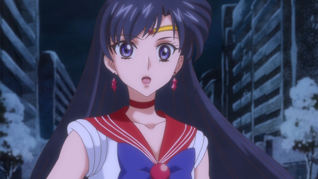
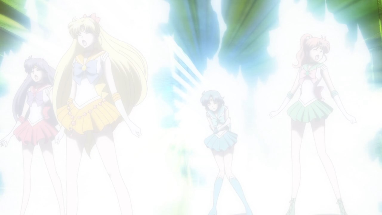
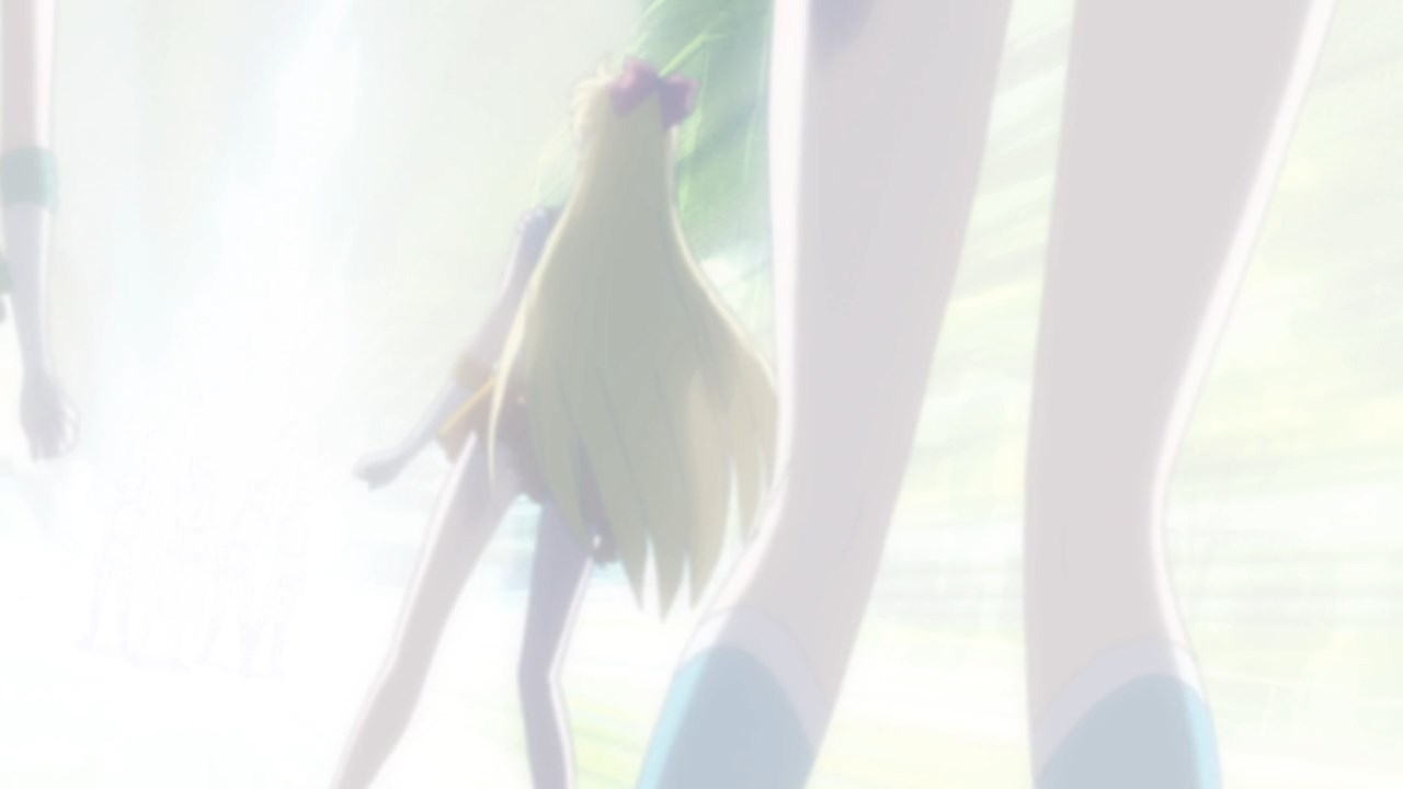
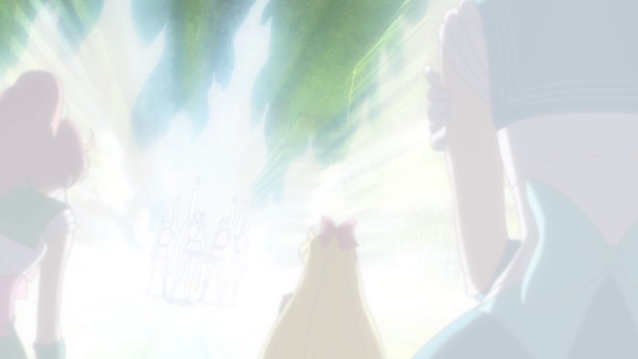
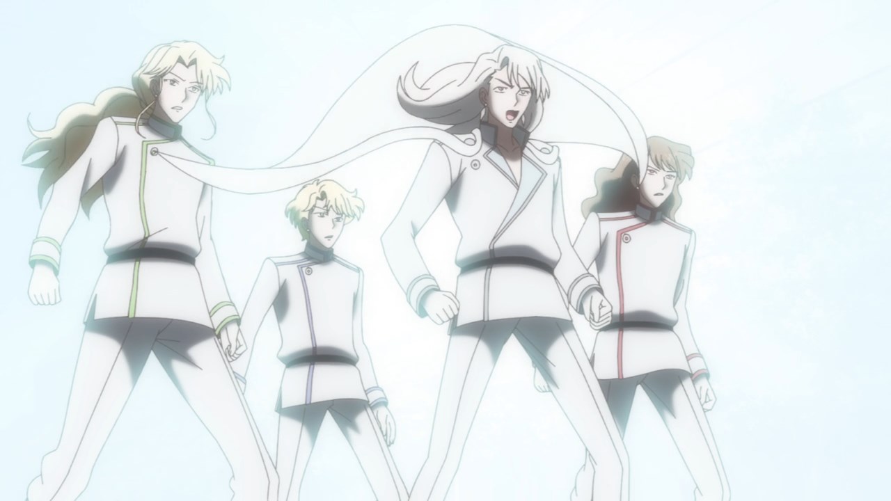
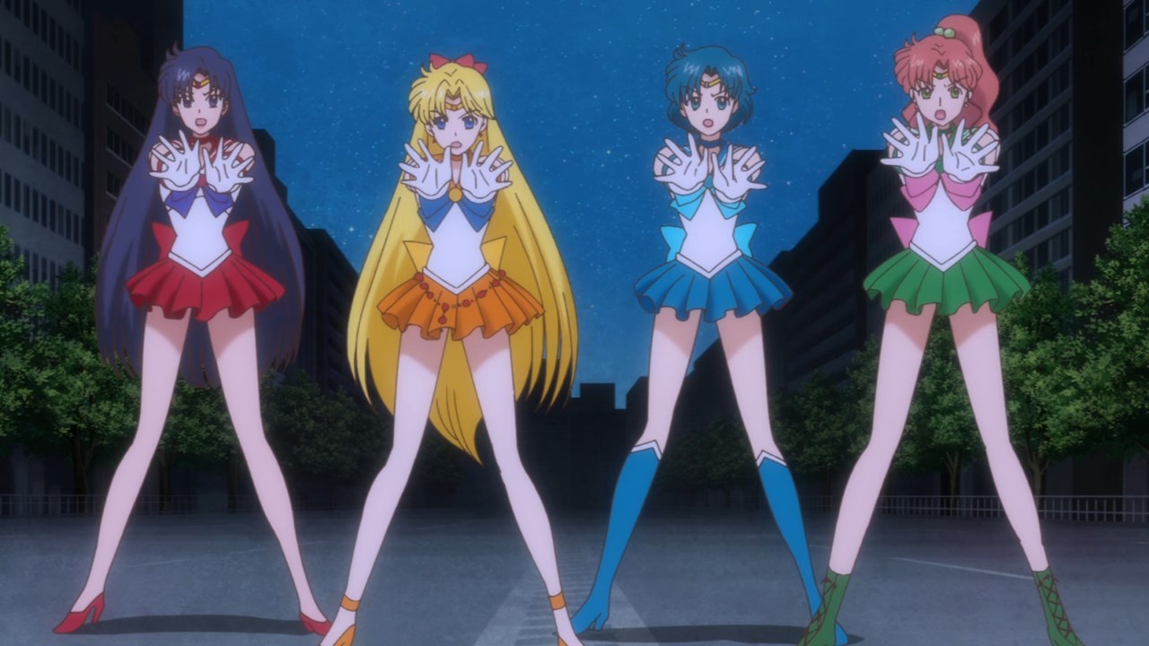
If there’s one good thing about all those changes is that the Sailors are not ridicuolous thin! Specially Mars.
How come there were some designs that I think were unnecessary for changes??
I wish I knew. lol
Looking back, Ive come to the conclusion that the animation director along with the Chief animation director are the ones going back to make these changes. I noticed similarites in Komatsu’s frames from the first ep (and a few key frames from other eps) and they match the style seen in this eps redraws. Of course Komatsu and Takahashi’s art clash BIG TIME which is why they look weird here
But that’s just theory and speculation. I could be wrong.
What about the lack of Mercury and Jupiter’s chokers when traveling to the moon? Have they fixed it?
Yeah they were added on